top of page
IDENTITY
Winnebago
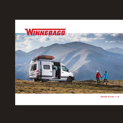
There are only so many iconic American brands like Winnebago. Its bold red sanserif logo has mostly stayed the same since it first graced the sides of the RVs found throughout America's national parks and interstates. I had the opportunity to evolve the logo with a talented team of designers. We decided that less was more. I made minor, almost imperceptible, typographic adjustments to balance the stokes and spacing. Fixing blemishes that had crept in over time. As part of the exercise, we developed a tagline, "Bound by the W," and a design system that reached out to the Winnebago community—a close-knit network of enthusiasts with their own wave and language.


bottom of page